The practical answer
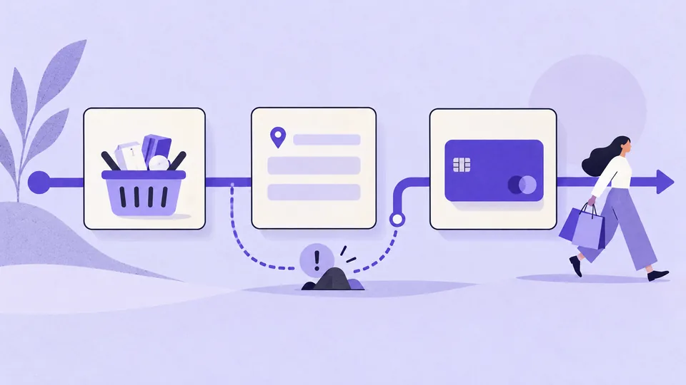
Reduce avoidable checkout friction by showing the complete cost early, making guest checkout easy to find, asking only for necessary information, and helping people recover from payment or form errors. Start with the step where your own shoppers struggle, then test one clear change.
What to fix first
- Show shipping, taxes, and other unavoidable charges before the final payment action, or clearly explain what still depends on the delivery address.
- Make guest checkout visible without forcing people to dismiss an account-creation screen.
- Keep entered information when validation fails or payment needs another attempt.
- Separate payment authorization from order confirmation so an uncertain response does not encourage duplicate purchases.
- Measure checkout completion alongside payment failures, support contacts, and order quality.
Find the actual source of abandonment
An abandoned cart is not always a usability failure. A shopper may be comparing prices, saving products, or waiting to buy. Separate cart creation, checkout initiation, payment attempts, and confirmed orders in your funnel. A drop before checkout suggests a different problem from repeated declines after payment details are entered.
Compare the same funnel by device, delivery region, and payment method. Check that analytics events represent completed actions rather than button clicks. For example, a payment button click does not prove that the payment provider accepted the request. Respect consent choices and avoid putting personal or payment information into analytics events.
Use usability sessions and support messages to explain the pattern. Ask participants to complete a realistic purchase with an appropriate test account and payment environment. Observe where they pause, backtrack, or misread a label. Do not ask them to spend their own money simply to test a design.
Design the checkout around five decisions
1. Can I buy without creating an account?
Present guest checkout as a clear route alongside sign-in. Explain the value of an account after purchase, when the order is secure. If an account is genuinely necessary for the service, explain that requirement before the checkout begins rather than revealing it at the payment step.
2. What will the order cost, and when will it arrive?
Keep an order summary close to the task. Show the selected items, quantity, delivery option, estimated arrival, and total. If the delivery cost requires a postcode, let the shopper estimate it early. When changing the address changes a fee or delivery date, visibly update the summary and let the shopper review the new amount.
3. What information do I need to provide?
Use persistent labels, appropriate autocomplete attributes, and input types that support the expected data. Make optional fields visibly optional. Do not require a company name for a personal order. An address form should accept realistic regional addresses, including details that do not fit a rigid street-number model.
Validate at a useful moment. An empty field should not show an error while someone is still beginning to type. After submission, show a concise error summary and connect each message to its field. Explain the correction: “Enter a phone number including the country code” is more useful than “Invalid input.”
4. Which payment option works for me?
Offer payment methods that your customers can actually use and that the business can support. Explain relevant conditions before selection. Preserve the cart and permitted form information when a payment attempt fails. Never store sensitive payment details in client-side persistence merely to make retry easier.
5. What happens when I place the order?
The final action should communicate its consequence, such as “Place order and pay.” Show the payable amount next to that decision. While processing, prevent accidental repeated submissions and communicate the current state. Confirmation should include an order reference and the next expected step.
Handle uncertain payment results
A timeout is not the same as a declined payment. If the result is unknown, explain that the system is checking the order rather than immediately asking the customer to pay again. The interface and backend must agree on retry behavior, order identifiers, and protection against duplicate submissions.
For a confirmed decline, provide a route to retry or choose another method. For an unavailable item, explain which item changed and preserve the rest of the basket. Keep recovery messages specific without exposing sensitive provider details.
A focused improvement cycle
- Choose a failure. Example: mobile users repeatedly miss the delivery-price change after entering their address.
- Write the hypothesis. Showing the updated delivery charge beside the address confirmation may help users understand the new total before payment.
- Prototype the complete state change. Include an address change, fee update, validation error, and a return to the previous step.
- Test comprehension. Ask users what they expect to pay and when the order should arrive. Do not lead them toward the new component.
- Release and evaluate. Compare the defined outcome with a suitable baseline or controlled experiment, while checking guardrail metrics.
This is a hypothetical example, not a reported client result. The design should change when observation shows a different cause.
Arabic, RTL, and regional details
Apply RTL direction to the Arabic page while handling mixed strings deliberately. Email addresses, reference numbers, and international phone numbers may need directional isolation. Check the visual order of the currency, amount, and delivery estimate using actual Arabic content.
Test addresses from the regions you serve instead of translating a single foreign address template. Explain cash-on-delivery availability, fees, or restrictions where that payment method is offered. Keep language selection stable throughout checkout and preserve the basket when changing language.
Measure completion without hiding new problems
| Measure | Definition to agree on | What it can reveal |
|---|---|---|
| Checkout completion | Confirmed orders divided by eligible checkout starts in a defined period. | Whether more people complete the purchase journey. |
| Payment failure rate | Failed payment attempts divided by payment attempts, separated by failure type. | Technical or method-specific problems that a visual redesign cannot solve. |
| Form recovery | Sessions that correct an error and continue after an invalid submission. | Whether validation messages help people move forward. |
| Support contacts and duplicate orders | Relevant cases associated with the checkout release. | Whether apparent completion gains come with confusion or operational cost. |
Use a consistent denominator and attribution window. Compare like-for-like traffic and account for promotions, stock changes, and delivery changes. A small movement in a dashboard is not automatically evidence that the design caused it.
Before release
- Complete the journey on a small screen using only the keyboard where applicable.
- Check labels, error announcements, focus order, and payment-provider transitions with assistive technology.
- Try a long address, an Arabic name, a declined payment, and a interrupted connection.
- Confirm that going back preserves appropriate information and does not create a second order.
- Verify that the confirmation page agrees with the recorded order and expected notification.
- Check image weight, layout stability, and the responsiveness of the form under slower connections.
Further reading
- Baymard Institute: checkout usability research for a research-based view of common checkout issues.
- W3C WAI: forms tutorial for labels, instructions, validation, and accessible form feedback.
- How to conduct a UX audit for turning observations into prioritized work.